Pantone’s
Spring 2016 Fashion Color Report: “Transformative”
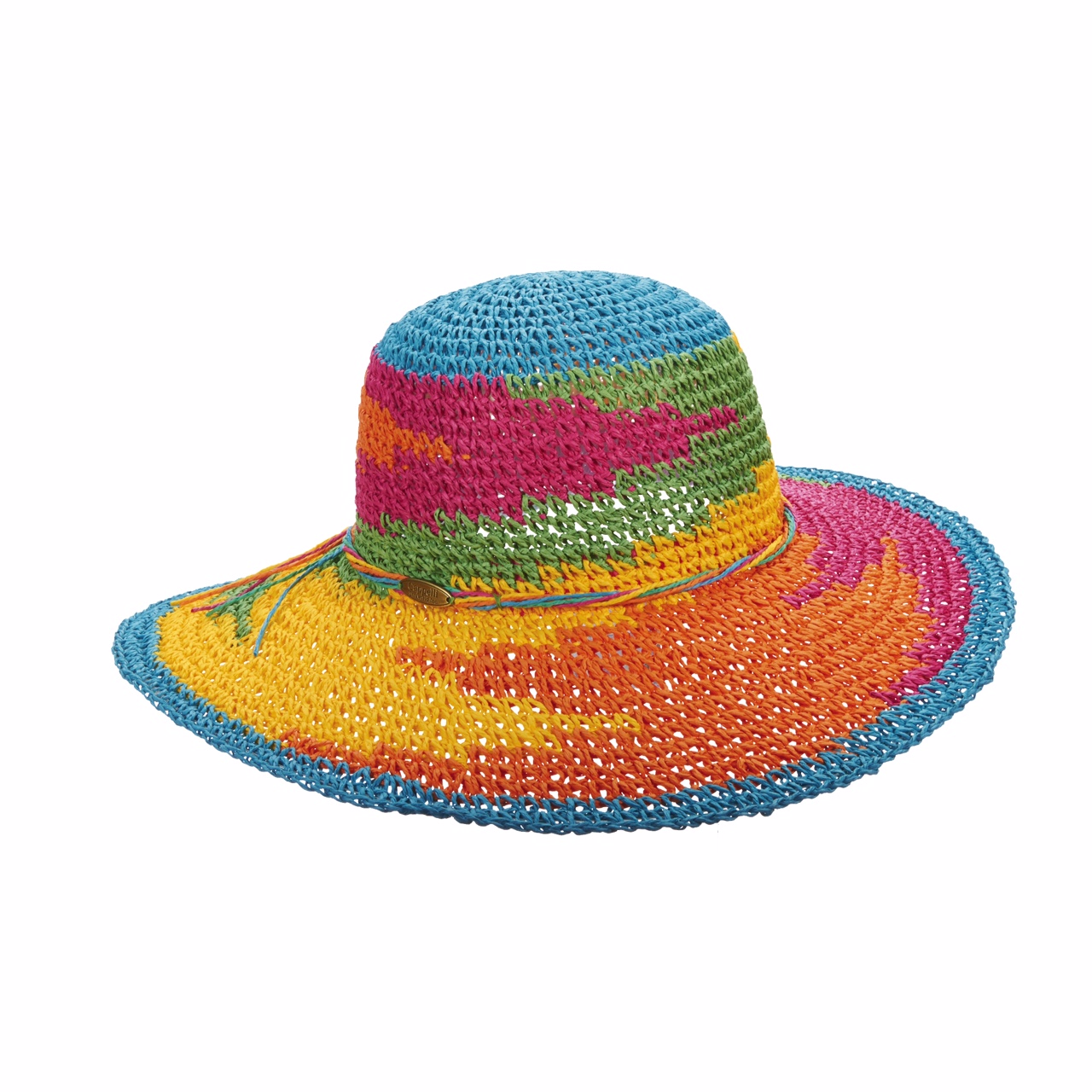
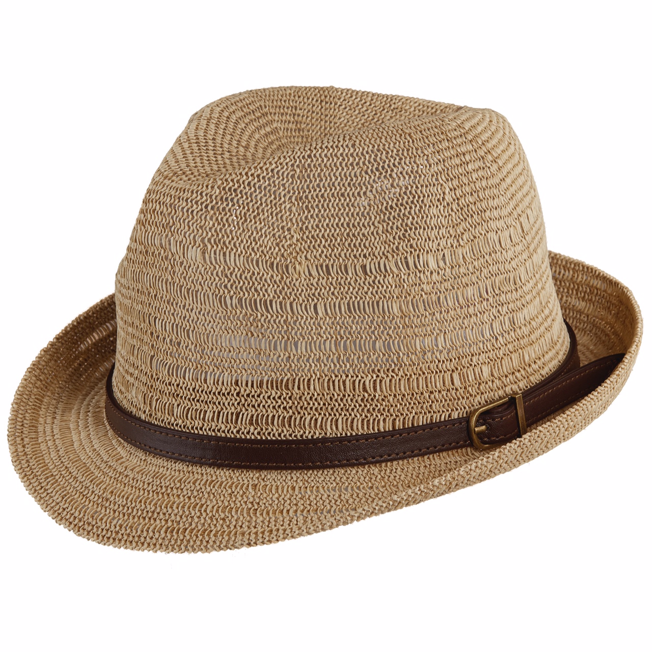
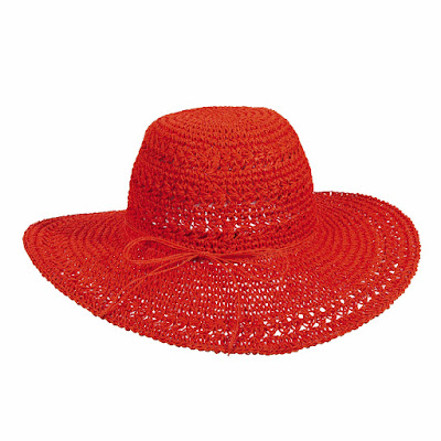
As a follow up to sell "fashion not hats", check out this report from ACCESSORIES MAGAZINE. I have added hats from the S16 catalogs which merchandise back to the S16 pantone colors. The chosen styles are in fact a random selection from the catalogs. When you look at this report you will see that our collections are strewn with on trend fashion colors and silhouettes.
NONE of the competition offer the gamut of fashion styles and colors that we do.
The PANTONE color names are just syntactics. Most of your customers will not even know them but it's good for you to know them.
You say fiesta, I say orange. You call it coral, I call it peach.
Christian Siriano Sketch
Carlstadt, NJ—Most of the
Spring/Summer 2016 fashion shows are taking place at Skylight at Moynihan
Station, the historic James A. Farley Post Office in Manhattan. But today’s
NYFW news comes from New Jersey, home of Pantone, the color authority.
To coincide with New York Fashion Week, Pantone once again debuts its
Fashion Color Report, a comprehensive overview of designers’ use of color in
their upcoming Spring 2016 collections. This year’s report features designers
including Nicole Miller, Rebecca Minkoff, Pamella Roland, and many others using
the top colors of the spring season: Rose Quartz, Peach Echo, Serenity, Snorkel
Blue, Buttercup, Limpet Shell, Lilac Gray, Fiesta, Iced Coffee, Green Flash.
The Spring 2016 Pantone Fashion
Color Report is one of two semiannual reports published for the fashion
industry, features the top 10 colors for women’s and men’s fashions, along with
designer sketches and inspirations. (The complete report is available at
pantone.com/Spring-2016.)
Rebecca Minkoff Sketch
“The colors emerging in the Spring
collections serve as vehicles that transport wearers to more tranquil, mindful
environs which encourage relaxation first, followed by curiosity and
exploration,” reports Pantone.
‘Calm and Relaxation’
“The color palettes of this season
transport us to a happier, sunnier place where we feel free to express a
wittier version of our real selves,” said Leatrice Eiseman, executive director
of the Pantone Color Institute. “Yet with our culture still surrounded by so
much uncertainty, we are continuing to yearn for balance by incorporating those
softer shades that offer a sense of calm and relaxation.”
Designers were also inspired by the
contrast of urban design and lush vegetation, leading to unexpected color
combinations and collections reminiscent of architecture, travel and nostalgia.
By creating looks that truly represent the world we live in, both constructed
and organic, designers sought to awaken a sense of reflection, followed by
playful escapism.

Fine Art Factor
Fine art is also an inspiration. In
particular artists–many of whom are known for bold color usage and strong
shapes and lines, played an influential role in this season’s styles – from
Matisse, Picasso and Frank Stella to Esther Stewart and Sam Falls. With Cuba
and other destinations south of the border top of mind, designers are playing
with courageous color statements; coupling these vibrant hues with quieting,
classic and more natural tones.
Colors shown on the runway also
transcend cultural and gender norms. Vivid brights give way to excitement and
optimism, though quiet stability prevails in this season’s palette. For Spring
2016 there are truly no perceivable distinctions in color choices between the
men’s and women’s collections, both of which focus on a desire to breathe and
reflect, then play.
The top colors for men’s and
women’s fashion for Spring 2016 are:
 |
| LC541-PINK |
 |
| LP113-FUCH |
Rose Quartz, a persuasive yet gentle
tone that conveys compassion and a sense of composure. Like a serene sunset or
budding flower, “Rose Quartz reminds us to reflect on our surroundings during
the busy but lighthearted spring and summer months.”
 |
| CR243-CORAL |
 |
| LC399-GRAPEFRUIT |
 |
| TBWL57-CORAL |

Peach Echo, a
shade that emanates friendlier qualities, evoking warmth and accessibility.
 |
| LC399-M BLUE |
Serenity, a blue sky color comforts
with a calming effect, bringing a feeling of respite even in turbulent times. A
transcendent blue, Serenity provides us with a naturally connected sense of
space.
 |
| CR255-ASST NAVY |
 |
| CR251-ASST NAVY |
 |
| LD70-ASST ROYAL |
Snorkel Blue is
a member of the navy family, but with a happier, more energetic context; it’s
maritime inspired, implying a relaxing vacation and encourages escape.
 |
| LC399-BANANA |
 |
| csw232-asst |

Buttercup is
expressed designers reveal a shining beacon transporting its wearer to a
happier, sunnier place.
 |
| LT64-ORANGE |
Fiesta is a high energy harbinger of
excitement, encouraging free-spirited exploration to
unknown but welcoming locales.
 |
| LC399-PERIWINKLE |
 |
| LT176-ASST DENIM |
 |
| TBWL61-BLU |

Lilac Gray has the subtlety of the
lilac undertone with a distinctive edge to this classic gray shade.
 |
| LC737-ASST KHAKI |
 |
| LC768-ASST NAT |
 |
| BAG951-ASST TOAST |

Iced Coffee is
a transitional color that will take us through the season as another strong
neutral. With its natural earthy quality, the softness and subtlety of Iced
Coffee creates a stable foundation when combined with the rest of this season’s
palette.
 |
| LC754-ASST AQUA |
 |
| CR242-ASST AQUA |
 |
| CR245-ASST AQUA |
 |
| TBWL57-AQUA |

Limpet Shell is
clear, clean and defined shade of aqua that leans toward the green family and
is suggestive of clarity and freshness, its crisp and modern influences evoke a
deliberate, mindful tranquility.
 |
| LC713-ASST GREEN |
 |
| LC399-MINT |
 |
| BAG965-ASST |
 |
| CSW23-ASST LIME |

Green Flash calls
on its wearer to explore and escape the mundane, radiating an openness that
combines with the rest of the palette in unexpected but serendipitous ways. The
popularity of this brilliant hue is representative of nature’s persistent
influence even in urban environments, a trend continuing to inspire designers.